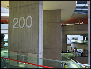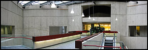
 And here we have the Detroit Renaissance Center. It appears that in
the seventies, there were architects that thought "Concrete looks
good." Well, history has proven them wrong on many occasions. This
is just a dramatic example of it.
From the outside, the Detroit Renaissance Center looks impressive. It's only
when you get inside that it becomes obvious how bad it can get.
On the architect's web site today, The Renaissance Center is notably not among his list of "Achievements"
I took these shots on a fairly bright day so the place is not nearly as depressing as it can get...
Enjoy.